Champagne, Pearl White, or Silver Gray: How to Choose a Silk Pillowcase Color
Short answer: choose Champagne if your bedroom leans warm and softly layered, Pearl White if you want a clean and versatile neutral, or Silver Gray if you prefer a cooler, understated look. The best silk pillowcase color is the one that works with your bedding, lighting, and normal care routine—not simply the shade that looks brightest on a screen.
Champagne, Pearl White, and Silver Gray at a Glance
| Color | Overall character | Often works well with |
|---|---|---|
| Champagne | Warm, soft, quietly luxurious | Cream, beige, taupe, warm wood, muted green, and dusty rose |
| Pearl White | Clean, light, and classic | White, ivory, pale neutrals, dark contrast bedding, and most minimalist rooms |
| Silver Gray | Cool, calm, and contemporary | Gray, charcoal, cool white, blue, black, and modern neutral palettes |
This comparison is a starting point rather than a strict design rule. Silk reflects light differently across its folds, so the same color can appear brighter near a window and deeper under warm evening lighting.
Start with the Undertones Already in Your Bedroom
Before choosing a pillowcase, look at the largest surfaces in the room: your duvet cover, sheets, headboard, curtains, walls, and floor. Decide whether the overall palette feels warm, cool, or balanced.
- Warm rooms often include cream, beige, camel, warm brown, brass, and honey-toned wood.
- Cool rooms often include crisp white, blue, charcoal, black, chrome, and blue-based gray.
- Balanced rooms combine warm and cool neutrals without one clearly dominating.
A pillowcase does not need to match every textile exactly. It only needs to feel intentional beside the colors closest to it.
When Champagne Is the Right Choice

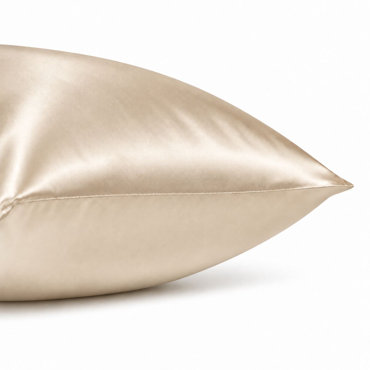
Champagne introduces warmth without requiring a strong accent color. It can soften an all-neutral bed and works particularly well when the room includes cream, natural linen, warm white, taupe, or wood.
Choose Champagne when you want the silk to be visible but not loud. Its warmer character can add depth to pale bedding while remaining easy to combine with other muted colors.
Try Champagne with
- Cream or ivory sheets for a tonal, layered bed
- White bedding when you want a gentle warm contrast
- Taupe, camel, or warm gray for a quiet hotel-inspired palette
- Sage, olive, or dusty rose as soft supporting colors
Shop the Champagne Silk Pillowcase
When Pearl White Is the Right Choice

Pearl White is the most straightforward option for a light, clean bed. It can blend into white or pale bedding, allowing the sheen and drape of the silk to provide the visual difference rather than a strong color change.
It is also useful in darker rooms. Against charcoal, navy, or deep wood tones, a light pillowcase creates a clear contrast and keeps the bed from feeling visually heavy.
Try Pearl White with
- White-on-white bedding for a simple, unified look
- Ivory and oatmeal layers for subtle variation
- Dark gray, navy, or black bedding for crisp contrast
- Patterned bedding when you want the pillowcase to remain visually quiet
As with other pale textiles, cosmetic or hair-product marks may be easier to notice on Pearl White. That does not change how the silk performs, but it may influence how frequently you prefer to wash it.
Shop the Pearl White Silk Pillowcase
When Silver Gray Is the Right Choice

Silver Gray creates a cooler, more architectural look. It can bring definition to a white bed without the stronger contrast of charcoal, and it fits naturally into bedrooms built around gray, blue, black, or cool white.
Choose Silver Gray if you like neutral bedding but want more separation between your pillows and sheets. It can also connect light bedding with darker furniture or a gray upholstered headboard.
Try Silver Gray with
- Cool white sheets for a restrained contrast
- Gray bedding in lighter or darker tones
- Navy or muted blue for a calm, cool palette
- Black accents and pale wood in a contemporary room
Shop the Silver Gray Silk Pillowcase
Should Your Pillowcase Match or Contrast?
Matching creates a calm, continuous bed. Contrasting makes the pillowcase more visible and can turn a practical item into a small design detail.
If you prefer a minimal look, stay within the same color family as your sheets and duvet. If your bed feels flat, choose a neighboring neutral with a different temperature—for example, Champagne against white or Silver Gray against ivory. The contrast remains subtle, but the layers become easier to see.
You can also use two colors together. A pair of Pearl White and Champagne pillowcases feels warmer and softer; Pearl White and Silver Gray creates a cooler, cleaner combination.
Check the Color in Daylight and Evening Light
Silk has a lustrous surface, so highlights and shadows move as the fabric folds. Natural daylight usually shows the underlying color most clearly, while warm bedside lamps can make Champagne appear richer and cool grays appear softer.
Screen brightness, display settings, and photography can also affect what you see online. Product images are useful guides, but no screen can guarantee an exact color match with bedding already in your home.
Does Color Affect Silk Quality?
No. Color alone does not tell you whether a pillowcase is made from silk, what its momme weight is, or whether both sides use the same material. Evaluate color separately from construction.
Before buying, check the fiber content, momme weight, exact size, closure, care instructions, and whether silk is used on both exterior faces. Our guide to double-sided silk pillowcases explains what that construction means. If you are comparing natural silk with synthetic satin, read silk vs satin pillowcases.
A Simple Three-Step Decision
- Identify your room's temperature: warm, cool, or balanced.
- Choose your effect: blend with the bedding or add restrained contrast.
- Consider your routine: decide whether you prefer a very light shade or a mid-tone neutral for everyday use.
If you are still undecided, place a cream, white, and gray textile on your bed and view them in both daylight and evening light. The one that feels most natural in both conditions is usually the safest direction.
Caring for Your Chosen Color
Always follow the sewn-in care label. Wash silk gently with a suitable detergent, avoid bleach and fabric softener, and keep it away from direct sunlight while drying. Separate light and dark colors, particularly during early washes, and do not leave damp silk folded against another textile.
For a complete routine, see our guide to washing a 22 momme silk pillowcase.
Frequently Asked Questions
Which silk pillowcase color is the most versatile?
Pearl White is easy to combine with many light, dark, and patterned bedding sets. However, Champagne may be more versatile in a warm room, while Silver Gray often fits a cool or contemporary palette more naturally.
Does a darker color feel different from a lighter color?
Color should not determine the basic feel when the pillowcases use the same silk weight and construction. Any difference should be evaluated from the actual product rather than assumed from the shade.
Will the color look exactly like it does online?
Not always. Silk changes appearance with light and folds, and screens reproduce color differently. Use product photography as a guide rather than a guarantee of an exact match.
Can I mix two pillowcase colors on the same bed?
Yes. Mixing two quiet neutrals can add depth without making the bed feel busy. Keep one color connected to another element in the room for a more considered result.
Three Quiet Neutrals from Muse & Airy
The Muse & Airy 22 Momme Mulberry Silk Pillowcase is currently offered in Champagne, Pearl White, and Silver Gray. Each color uses the same double-sided Grade 6A mulberry silk construction and hidden, color-matched zipper. Check the live product page for current size and availability before ordering.